🎧 Listen to this article
Prefer to listen? An audio version of this article is available for accessibility and convenience.
The most quietly overlooked change in iOS 26.4 affects something you probably tap past without thinking — the profile icon in the top-right corner of Music, Podcasts, TV, and the App Store. Tap it now and you’ll find something genuinely different: a redesigned Apple Account hub with logical groupings, consistent visual structure, and two new options that were technically available before but buried well enough that most iPhone users have never touched them.
Apple Account pages in apps have been a low-priority item for years. Every app handled the layout differently, and anything beyond checking your subscription status required hunting. iOS 26.4 changes that — but quietly enough that the update notes don’t exactly scream “go check your Music profile.” The redesign isn’t a complete overhaul. It’s a polish job that turns a genuinely frustrating corner of iOS into something functional.
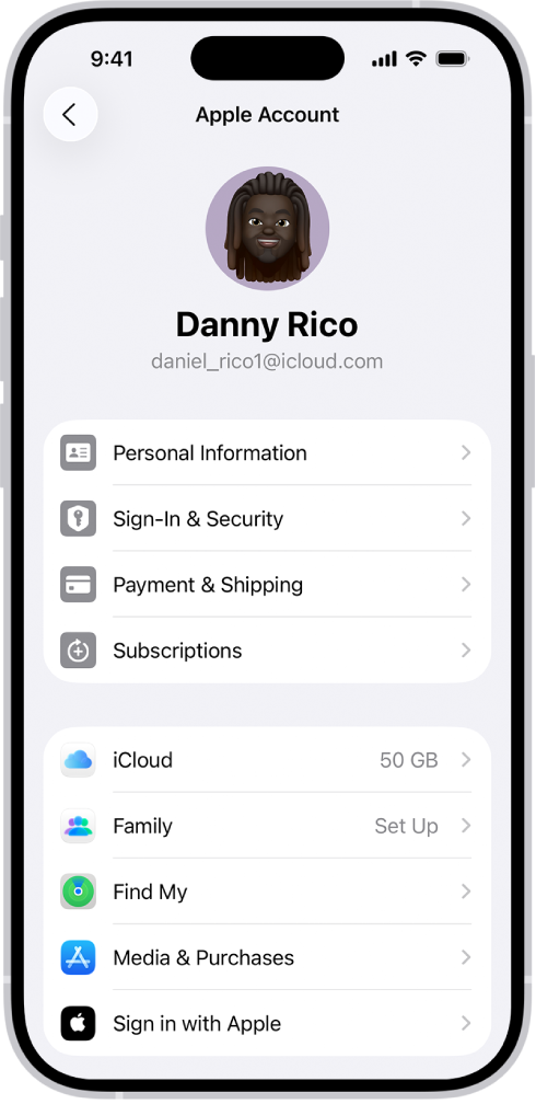
Finding the updated interface takes less than ten seconds. Open Music, the App Store, Podcasts, or Apple TV, and tap the circular profile photo or account icon in the top-right corner. What appears now looks consistent across all four apps — same visual groupings, same layout logic. If you’ve opened that screen before and immediately closed it because nothing made sense, this is worth reopening.
 Ad
AdWhat the Redesign Actually Did to the Layout
The previous Apple Account screens in these apps had an organizational logic that was hard to describe because it didn’t really exist. Subscription options, payment methods, gifting options, purchase history — these could appear in almost any order, and the arrangement varied by app. The updated design introduces clear groupings: account-level information sits near the top, subscription status follows, and transaction tools including gifting options appear below that. It aligns with the broader iOS 26.4 design direction — the same update that brought new Liquid Glass display toggles to Settings — though the in-app account screens stop short of the full Liquid Glass treatment found elsewhere in the OS.
Two new additions are worth noticing immediately: Add Money and Send Gift. Add Money gives you a direct path to loading credit into your Apple Account balance from within the app — useful if you prefer to spend from a pre-set account balance rather than charging a connected card for every small purchase, and it eliminates the Settings detour that process used to require. Send Gift moves the gifting workflow from buried product pages to the account hub itself, making it far more obvious that gifting apps, games, music, or subscriptions to other Apple users is even something you can do from inside an app.
While I appreciate that Apple updated the four most transaction-heavy apps, the inconsistency with Apple Books is hard to ignore. Books still shows the old account page design — scattered options, no Add Money shortcut, no Send Gift entry point. If you buy audiobooks or ebooks regularly, your account experience in Books is genuinely worse than in the App Store now, and that split creates real friction when you switch between them. I think Apple knows this is unfinished work, but shipping it in this state feels like half a job done.
The table below shows how in-app Apple Account pages changed in iOS 26.4 across the dimensions users notice most — and where Books still falls short.
| Feature | Before iOS 26.4 | After iOS 26.4 |
|---|---|---|
| Layout | Scattered, inconsistent per app | Logical groupings, consistent across Music, Podcasts, TV, App Store |
| Add Money | Buried in Settings | Direct shortcut in account hub |
| Send Gift | Hidden on individual product pages | Direct option in account hub |
| Visual design | Plain, minimal visual hierarchy | Aligned with iOS 26.4 design language |
| Books support | Old design | Still old design — not updated in iOS 26.4 |
Part of why this redesign matters beyond its modest scope is what it represents. iOS 26 has been progressively replacing “Apple ID” with “Apple Account” across every surface — Settings, sign-in flows, onboarding screens for new devices, even password prompts. This in-app refresh is the first time that name change has had a concrete visual result in the apps where most people actually use their account to spend money. The four updated apps are where Apple content gets purchased, and making the account layer cleaner in those specific places makes real practical sense.
 Ad
AdThe Two Features That Actually Make a Difference
Add Money in the new account hub lets you load funds directly into your Apple Account balance without leaving the app. Once funds are in your balance, they apply automatically to purchases across the App Store, Music, Apple TV, and Apple Books. You set a balance and spend against it rather than triggering individual card charges each time. This works well for controlled spending, for family accounts where a teenager has a set spending allowance, or for anyone who received an Apple Gift Card and wants to apply it without navigating away from what they were already doing. The earlier, Settings-based path to add funds existed but required enough steps that most people simply charged their card instead.
Send Gift works slightly differently depending on which app you’re in. In the App Store, it pulls up the gifting interface for apps and in-app purchases. In Music and Apple TV, it connects to Apple Gift Cards redeemable for content purchases. The workflow is faster in every case — before iOS 26.4, gifting anything through Apple meant locating the specific item, finding a Gift This link somewhere on the product page, and completing a separate checkout flow. Starting from the account hub makes the gifting intent visible rather than buried three levels deep.
The Part Apple Still Needs to Fix
Apple Books remains on the old account page design, and this creates the kind of friction that feels minor until you actually run into it. If you regularly buy from Books, your account page there still shows the cluttered pre-iOS 26.4 layout — no Add Money shortcut, no Send Gift option, and none of the logical groupings the other apps now have. Keep in mind that if you have content tied to an Apple One bundle or an Apple Books subscription, managing that portion of your Apple Account still routes through the old interface. In the worst case, you’re operating two different mental models for Apple account management depending on which app you last opened.
What I’d like to see is Apple extending this redesign to Books in the next content update rather than letting the inconsistency sit. The entire premise of the change was consistency across apps — one interface, one set of expectations. One significant holdout undermines that premise every time someone who uses Books compares it to the updated App Store experience. This should have shipped as a complete set.
Where to Access Your Redesigned Apple Account
- Music — Open Music and tap the profile photo in the top-right corner
- App Store — Open App Store and tap the profile photo in the top-right corner
- Podcasts — Open Podcasts and tap the profile photo in the top-right corner
- Apple TV — Open the TV app and tap the account icon in the top-right corner
The Add Money and Send Gift shortcuts are worth a single visit to confirm they’re there and working in your setup. For a broader look at the other personalization changes that shipped alongside this update, the iOS 26.4 personalization controls guide covers the new display toggles and customization options that most users skipped during the initial update.

Related Posts
Your iPhone Wallet Tracks Packages — Enable It in iOS 26
Apr 27, 2026
iOS 26.4.2 Is Out — It Fixed the iPhone Privacy Flaw the FBI Already Used
Apr 24, 2026
What the iPhone Action Button Does When You Set It Up Right
Apr 20, 2026