🎧 Listen to this article
Prefer to listen? An audio version of this article is available for accessibility and convenience.
Apple’s Liquid Glass design in iOS 26 turns every menu, keyboard, and notification into a translucent, frosted-glass layer that shifts and refracts based on what’s behind it. It looks stunning in marketing materials. On your actual iPhone, in direct sunlight, with your brightness cranked to full, it can make the Settings app feel like reading through a shower door.
iOS 26.4 quietly added real customization controls for Liquid Glass — but Apple scattered them across three different menus. One lives in Display & Brightness. Another hides in Accessibility. A third got silently improved during the 26.4 update without a single mention in the release notes. There’s even a lock screen slider most people never find because it only appears in an editing mode you have to long-press to reach.
 Ad
AdThe Tinted Switch That Changes Everything
The single biggest Liquid Glass adjustment sits in Settings, then Display & Brightness, under a section called Appearance. Apple added a “Tinted” option back in iOS 26.1 that most people scrolled past because it sounded cosmetic.
It is not cosmetic.
Tinted mode replaces the see-through glass layers with opaque, solid backgrounds closer to what iOS 18 looked like before Apple redesigned everything. The UI elements still have their rounded edges and depth layering. Animations still respond to your touch. What disappears is the transparency itself. Menus stop being see-through. The keyboard gets a solid background. Notification banners stop shifting color based on your wallpaper.
For anyone who found iOS 26’s default look distracting or hard to read, Tinted mode is the first toggle worth trying. It keeps the iOS 26 design language while cutting the visual noise that makes certain screens genuinely difficult to parse in low-contrast lighting. I switched to Tinted mode for a week, and my eyes stopped doing that slight squint I hadn’t even noticed I was doing every time I opened Control Center.
Reduce Bright Effects Is the iOS 26.4 Addition Apple Barely Mentioned
This is new to iOS 26.4, and already the most useful visual accessibility toggle Apple has shipped in recent memory. Go to Settings, then Accessibility, then Display & Text Size, and scroll until you find Reduce Bright Effects. Apple added this without a single line in the update notes.
Here’s what it targets: every time you tap a Liquid Glass button, keyboard key, or interactive element, iOS 26 plays a brief bright flash — a highlight animation that confirms your tap registered. That flash is the “bright effect.” With this toggle on, your taps still register and visual feedback still exists, but the high-intensity flash gets swapped for a subtle dimming response.
If you find yourself rubbing your eyes after long text conversations or extended browsing sessions, this is likely why. The cumulative effect of hundreds of small bright flashes per hour is more fatiguing than most people realize. I turned it on and immediately noticed the keyboard felt calmer — that’s not a word I expected to use about a keyboard, but it is genuinely the right one.
 Ad
AdReduce Motion Now Actually Handles Liquid Glass Animations
Reduce Motion has lived in Settings, then Accessibility, then Motion for years. It handled the basics: parallax effects on the home screen, the zoom transitions when opening apps, and a handful of other system animations. Then Liquid Glass arrived and added an entirely new layer of motion — elements that shift, refract, and wobble in response to your touch and device orientation — and Reduce Motion initially missed most of it.
Apple fixed this in iOS 26.4. The toggle now suppresses the Liquid Glass fluid animations that respond to device tilt and scroll position. Menus still scroll. Apps still open and close. But the glass layers stop moving independently of the content they contain.
That distinction matters. Before 26.4, a user with motion sensitivity could enable Reduce Motion and still get hit with Liquid Glass wobble every time they scrolled a long page. The fact that this took until 26.4 to work properly is the kind of gap that should not ship in a finished product. Apple’s Human Interface Guidelines explicitly call for respecting user motion preferences in all custom views — and their own system UI was ignoring its own toggle.
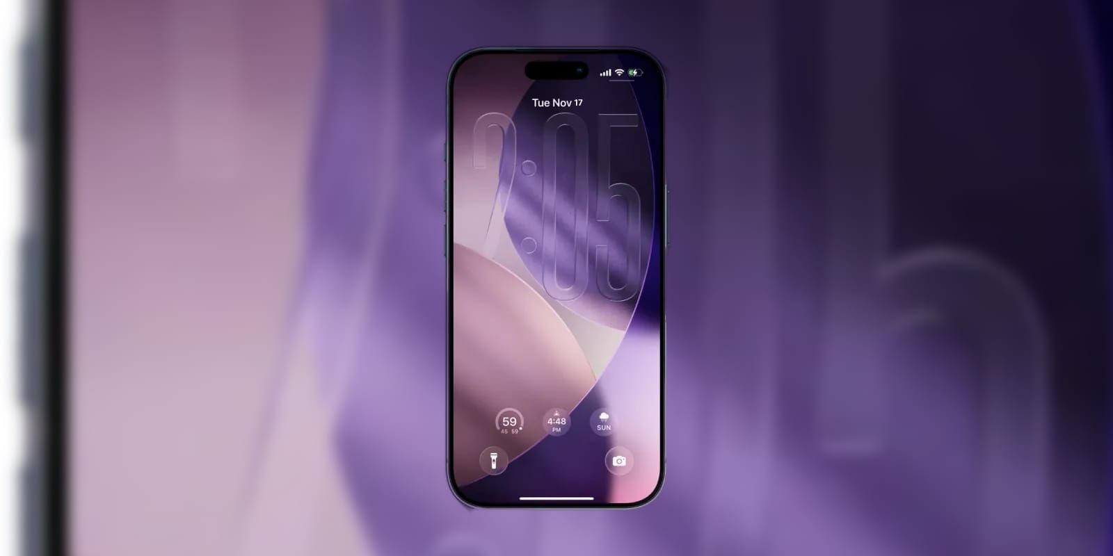
The Lock Screen Clock Slider Nobody Told You About
Apple expanded lock screen customization back in iOS 26.2 with a slider that adjusts how much Liquid Glass effect applies to your lock screen clock. Long-press your lock screen, tap Customize, then tap the clock face. A transparency slider appears at the bottom of the editing view. Slide left for a more solid, readable clock. Slide right for maximum glass refraction.
This slider only affects the lock screen clock — not notification banners, not widgets, not the wallpaper beneath. But the clock is the single element you glance at more than anything else on that screen, so getting its legibility right has an outsized impact on how your phone feels to use at a glance. On darker wallpapers, the default glass effect can make the time nearly invisible until your brain adjusts. Dragging that slider two notches to the left fixes it entirely.
Accessibility and Clarity
The AppleVis 2025 accessibility report landed Liquid Glass squarely in the conversation about Apple’s commitments to inclusive design. Apple’s visual accessibility score fell to 3.7 out of 5, down 0.2 points from the prior year, with Liquid Glass specifically cited as having a “significant negative impact” on users with low vision. The translucent layers reduce contrast ratios in ways that standard text-size and bold-text adjustments cannot fully compensate for.
Here is the combination that actually helps: enable Tinted mode in Display & Brightness first. Then turn on Reduce Bright Effects in Accessibility. Then toggle Increase Contrast in the same Accessibility menu — this thickens divider lines and darkens backgrounds across iOS, compounding well with the Tinted appearance. That three-toggle stack brings iOS 26.4 closer to the contrast levels of iOS 18 while keeping the structural layout Apple built for iOS 26.
VoiceOver continues to work correctly with all Liquid Glass elements. Apple’s screen reader remains, as the AppleVis report noted, the best on any platform. The problem is not VoiceOver users — it is sighted users with partial vision who depend on contrast rather than audio.
If you have already been exploring your iOS 26.4 settings, the Liquid Glass toggles are worth adding to that list. And if you want the full picture of what Apple changed in the iOS 26.4 personalization controls, those go deeper than Liquid Glass alone.
Related Posts
iOS 26.4.1 Fixes the iCloud Bug That Broke Your Apps
Apr 09, 2026
iOS 26.4 Drains Your iPhone Battery. Here’s What Fixes It
Apr 09, 2026
Your iPhone Finally Lets You Create Custom Ringtones in iOS 26
Apr 08, 2026